...Emerald!
Pantone.com
This is a trend prediction for next year, not an analysis of last year. We'll see how it goes - I thought their prediction for 2012, a reddish-orange, fell flat, while the prediction for 2011, a bright pink, was spot-on.
I'm always happy when green is involved!

Friday, December 7, 2012
Saturday, November 24, 2012
Relevance
Recently, I discussed the issue of relevance with a group of librarians at our monthly "think tank" meeting. As we discussed the issue, it reinforced my personal opinion: that yes, we can be relevant, but we have to make some decisions about what makes us relevant - and then commit to those projects.
It seems to me that whenever someone says that libraries are becoming less important, someone from ALA stands up and shouts "We are so!", and then begins to list every reason they can think of for the relevance of libraries: we are job search support, computers and Internet for the low-income, we are more reliable than search engines, we are early literacy educators, financial literacy educators, a social hub, a meeting space, a haven for seniors, a place to learn ESL, educational support for schoolchildren, and on and on.
I fear that we're hurting ourselves with this lack of a coherent, cohesive message. In this economy, we are in a position of needing to justify our continued existence and use of funds - not by shouting "How dare you?!" when someone questions that allocation, but by offering powerful, convincing reasons why donations and tax dollars given to the library are well-spent. Small projects and half-baked initiatives are not going to be convincing, not in the way we need them to be.
I think we are going to need to narrow our focus. We might end up needing to spend less money and time on Financial Literacy in order to do a FANTASTIC job on early literacy. Because doing a fantastic job is the only way to win support, both from our users and from financial decision-makers.
Obviously, each library/library system will make different decisions about their raison d'être, leaving the ALA to give the same old list. But if we can choose and succeed at out own reasons for relevance, we won't need the ALA to justify our existence. We'll be demonstrating our value every day.
Saturday, September 1, 2012
Marketing electronic resources: our five biggest mistakes
...and how to fix them!
5. Poor web design
Databases are a complex resource, and unless you're careful, they'll be hard to find, hard to browse and hard to search.
The fix: Let designers into the mix. Develop clear web way-finding, make sure we have good instructions and write a good "What are these and how do I use them?" introduction.
4. Marketing them as a lump
Saying "there's great stuff in the resources" isn't working. Very few people think "Ah-ha, THERE'S the great stuff! Just what I was looking for!"
The fix: We need to be promoting what individual resources can do. "Genealogy research? Try HeritageQuest!"
3. Using technical language and jargon to explain them.
You might not think "databases" is jargon, but I think it is - to a lot of people, a database is how you keep track of sales data, not a complex indexing of articles. We also need to watch out for "search Find It Virginia"' and other brand names.
The fix: My personal favorites are "articles" and "research," but you can use anything that makes sense to your non-library friends and family.
4. Attacking Google and Wikipedia.
Google and Wikipedia are fine for most people, who are just trying to find a good-enough answer and get on with their day. When we say "google isn't reliable" without putting that statement in context, we sound like this: "What's that, sonny? The inter-what? No, I don't trust that computer-thingy."
The fix: context! There are circumstances when you really need a specialized resource. When we talk about the differences between subscription databases and Google, we should be giving examples of times when Google won't do the trick.
5. Acting like they are equally useful to everyone.
They're not! Electronic resources are useful to certain subsets of our users, like students, scholars, business owners, etc. So again, be specific about what you're advertising, and to whom.
The fix: we should be marketing specific resources to the particular groups that will find them useful.
Sunday, August 12, 2012
2012 Retail Marketing Expo
Once again we visited the Retail Marketing Expo put on by our local retail merchants' association. A quick and belated recap:
Hot topics:
Video for business
The one area where I saw more vendors than I have previously. And it's relevant to us, too - we're in a space to consider videos as part of our new branding effort, or as part of a grant. Prices were actually lower than I expected; I saw packages advertised for $1,500 - $2,000. Lots of money, but not too much to consider.
Cheap or "ganged"' printing
I thought there were more printers here this year than last year, and they were advertising their discounts pretty heavily. I was surprised, though, about how little they were able to offer in the way of information (and not just networking). I was there to actually SHOP, and I had specific products in mind, and it was rare for someone to be able to tell me a price, or even to show me a paper sample. I would have liked an opportunity to get information that I can't get from a website - like the feel and weight of a paper.
Social media strategy
As a library, we really aren't in the market for this kind of service - and I guess they knew it! Even for the simpler types of services (that we might have been able to afford), there were not many ideas for how to apply the service to a nonprofit scenario. : ) To be fair, this was the Retail Marketing Expo - I think we need a Nonprofit Marketing Expo to really meet our needs.
Overall, I'm not sure I will want to go next year. There were some interesting things to see, but frankly the "making contacts" element of this event often seems wasted on me. I might want to for for an hour or so, but not to spend all day.
Friday, August 3, 2012
Interactivity
I've recently fallen in love with a museum blog. I'm finding that we have a lot of overlapping issues, both in terms of our business model (not "visitors=sales=money", but "visitors=stats=convincing people=money) and in terms of our goals and struggles - stay relevent, get people through the doors, engage younger people, get people interested in you and talking about you.
Here's a post I loved about interactivity:
http://museumtwo.blogspot.com/2012/06/17-ways-we-made-our-exhibition.html
and another post about how to create a successful interactive element:
http://museumtwo.blogspot.com/2009/04/design-techniques-for-developing.html
I think these ideas have a lot of potential applicability in libraries, especially when working with teens. Because one of the major struggles of adolescence is finding and expressing your identity, teens tend to like being encouraged to express themselves. Temporary or permanent interactive displays would be a great way to get teens engaged with the library.
Tuesday, July 17, 2012
Old-fashioned Charm: Love it or lose it?
Where I work, we build very sleek, modern libraries. They are lovely - high ceilings, lots of light, open spaces, modern signage. They fit well with the image we're trying to create (to the extent that we think about our image at all.) We try to portray ourselves as a new library for a new age - we are modern, slick, efficient; we are cool and professional. We use Barnes & Noble as our model. We're seeking a place in the business world, we're emphasizing our role in health information literacy and financial literacy, we think of our librarians as consultants. Our publications should portray us as "a winner."
Are we going the wrong way?
One thing I've noticed is that when people speak of libraries with affection, they are almost always talking about an old-fashioned experience. They love the feeling of peace and quiet, or they love the nooks and crannies, they love the sense of mystery, and the wonder of being surrounded by books - for many people, the older the books, the better. I've heard people wax nostalgic about paper dust. They don't want the experience of a large chain bookstore. They want the old-fashioned charm of a library.
While I love the open, airy spaces of our new libraries, and paper dust makes me sneeze, I can identify with this other perspective. I love old-fashioned libraries. I love mysterious staircases and hidden corners and yes, I love old books. I once read a quote that said that the love people have for their library is inversely proportional to the size of the library - that small libraries would always be beloved, in a way that large libraries never would be.
I think that New York Public Library gives this the lie. Look at the recent reaction when they considered moving their stacks. Their reading room is beautiful and well-used, and they have a rich array of cultural programming. The lions that flank the entrance are so iconic that they had a children's television program named after them (PBS's Between the Lions). They are a huge library serving a huge population, and yet they are loved.
The simple fact is, old-fashioned libraries are an emotional brand with a lot of positive resonance. As we move our library into a sleek, almost corporate image, what will our emotional impact be? We've worked hard to get away from the old-fashioned nostalgia, but I'm worried that we've driven away the people who love us the most. How will we regain their love? How will our sleek professionalism gain anyone's love?
I'm not ready to give up on the modern library yet, but we're going to need to think hard about the way we brand ourselves. We want to be professional, but we need to stay human, need to be approachable - we need to be able to be loved.
Sunday, July 1, 2012
Tips to Encourage Creativty
Here are some of the ideas I gleaned from reading Imagine. I'm focusing these tips on group creativity - the kind that is more concerned with creative problem solving than with making pretty posters.So, what can you do at your library to encourage creativity?
1. Arrange for people who don't usually work together to run into each other. My library started making everyone conduct their staff meetings in the administrative offices. Now we see people from different branches on a regular basis, giving us the opportunity to share ideas.
2. Create teams that have some people who already know each another, and some who don't. This will help people feel comfortable enough to share freely, but still inject new ideas.
3. Go to conferences and retreats. They don't have to be very expensive or very far away. Getting away from your routine locations will also help you get away from routine thinking.
4. Keep conversations positive, but always encourage free debate. It's important to share ideas, and it's also important to discuss - talk about the pros and cons, talk about the flaws, talk about the failures as well as the successes. You're more likely to get the conversation you need to find a good idea, and to transform a good idea into a great one.
5. Share office space. I know, it's a pain - you can't hear on the phone, and you can't eat a king-sized bag of M&Ms without feeling judged. But people in shared space tend to talk, and it turns out that it really does help to bounce your ideas off someone else.
6. Make connections between people with different job functions. Don't just put all the librarians together on a team, and all the circulation staff together, and all the managers together. Again, this is a way to keep your brain open to new ideas - you have to hang around people with a different perspective.
7. Allow everyone some time to pursue new ideas and areas of interest. You'll drastically increase your idea pool, and you'll create some mental room for innovation.
To learn more about these ideas, read the book!
Saturday, June 30, 2012
What I'm Reading: Jonah Lehrer's Imagine
I know Jonah Lehrer has been getting some bad press lately for recycling his writing, but he's still one of the most gifted science & psychology writers I know of. So I'm not going to worry about it.
Imagine is about creativity - not just artistic creativity, but productive creativity. How do people come up with good ideas? And how do they turn those good ideas into finished products, like inventions or albums or websites? These are the questions that Lehrer addresses in this book, with a combination of psychological research and individual stories.
I found it to be a fascinating read. As I said, Lehrer is a gifted writer, and the book reads quickly and smoothly. I learned that caffiene is helpful when we need to focus on refining and perfecting an idea, but that it impairs the "remote associations" that allow us to germinate ideas and come up with novel solutions to problems. Because of those same remote associations, we are more likely to have an "aha!" moment when we're relaxed, and thinking about something else. And in order to change our thinking, it helps to change our scenery - travel really does help get you out of a creative rut!
Mostly through anecdotes and case studies, Lehrer also covers group creative processes - the things that help us be more creative and productive as teams. I found these chapters to be especially interesting. I was inspired to think about the way my office/group works at the library, and about whether we really operate in the best way to encourage our creativity and productivity.
The next post will be some quick tips based on this book for encouraging creativity in your library or organization.
Favorite Library Logos
The logo research continues, and I've been looking at a LOT of library logos lately. (Alliteration: just one more service I offer.)Here are some of my favorites.
(I've linked to the library websites whenever I could, so you can see the logos in their native habitat.)
First, logos with books in them:
 Anchorage Public Library
This is one of my absolute favorites.
It's a book, but at the same time it looks very digital - you can see
it as being more about reading and knowledge than about the physical object of the book. Great colors but still nice in black-and-white.
Anchorage Public Library
This is one of my absolute favorites.
It's a book, but at the same time it looks very digital - you can see
it as being more about reading and knowledge than about the physical object of the book. Great colors but still nice in black-and-white.
 Beech Grove Public Library
Simple and elegant book-and-tree. The downside: the lettering. Why is the H large? And what's with the kerning? The bottom line especially.
Beech Grove Public Library
Simple and elegant book-and-tree. The downside: the lettering. Why is the H large? And what's with the kerning? The bottom line especially.
 Hamilton Public Library (Ontario)
What I like about this logo is the hand that holds the book. First of all, GREAT use of negative space. Second of all, it adds so much warmth and humanity to this image. It's not a picture of a book - it's a picture of a person USING a book. Wonderful.
Hamilton Public Library (Ontario)
What I like about this logo is the hand that holds the book. First of all, GREAT use of negative space. Second of all, it adds so much warmth and humanity to this image. It's not a picture of a book - it's a picture of a person USING a book. Wonderful.
 Daniel Boone Regional Library
A fun, colorful logo that still holds up in one color. Also check out the fun tie-in on their Bookmobile Jr: http://www.dbrl.org/outreach/bookmobile (scroll down)
Place-based logos
These logos focus on the LOCATION of their library, rather than of the CONTENTS of the library.
Daniel Boone Regional Library
A fun, colorful logo that still holds up in one color. Also check out the fun tie-in on their Bookmobile Jr: http://www.dbrl.org/outreach/bookmobile (scroll down)
Place-based logos
These logos focus on the LOCATION of their library, rather than of the CONTENTS of the library.
 New York Public Library
We're all jealous of New York Public Library. So beloved, such rich history. Their logo shows the lions which flank the entrance.
New York Public Library
We're all jealous of New York Public Library. So beloved, such rich history. Their logo shows the lions which flank the entrance.
 Chicago Public Library
I love the simplicity of this piece. Somehow it manages to seem like a solid institution of long standing, without seeming stodgy or out-of-date. The "Y" symbol, which forms the book in the center, is the "municipal device" of the city, and represents the Chicago River. (Read more here: http://chicago-outdoor-sculptures.blogspot.com/2010/01/y-symbol.html )
Chicago Public Library
I love the simplicity of this piece. Somehow it manages to seem like a solid institution of long standing, without seeming stodgy or out-of-date. The "Y" symbol, which forms the book in the center, is the "municipal device" of the city, and represents the Chicago River. (Read more here: http://chicago-outdoor-sculptures.blogspot.com/2010/01/y-symbol.html )
 Orange County Library System
Okay, so this logo isn't exactly to my taste, and I think there are some things wrong with it, and yet...it's bright, it's fun, and it represents its community. I had to include it here.
Graphic Logos
It's hard to do a good graphic logo, but when you get it right, it can be both modern and timeless. Here are a couple that I do like. (You may be noticing a tendancy towards circles at this point. I confess. I do like circles.)
Orange County Library System
Okay, so this logo isn't exactly to my taste, and I think there are some things wrong with it, and yet...it's bright, it's fun, and it represents its community. I had to include it here.
Graphic Logos
It's hard to do a good graphic logo, but when you get it right, it can be both modern and timeless. Here are a couple that I do like. (You may be noticing a tendancy towards circles at this point. I confess. I do like circles.)
 Hennepin County Library
I really like this. So simple, so bold.
Hennepin County Library
I really like this. So simple, so bold.
 Westport Public Library
It's graphic, it's flowing, it works in one color and at a small size. Very good.
Westport Public Library
It's graphic, it's flowing, it works in one color and at a small size. Very good.
 Marion Regional Library
Being a design and type geek, of COURSE I like this logo!
(Note: This logo seems to be ENTIRELY HOMELESS on the internet and to exist only within Google Images. I can't find a library with that name, and the designer's site won't load either.)
Marion Regional Library
Being a design and type geek, of COURSE I like this logo!
(Note: This logo seems to be ENTIRELY HOMELESS on the internet and to exist only within Google Images. I can't find a library with that name, and the designer's site won't load either.)
 Jefferson-Madison Regional Library
A local favorite of mine.
And a final, self-indulgent category......
RAINBOW LOGOS!
This section really has nothing to do with my professional opinion. I just happen to love rainbows
Jefferson-Madison Regional Library
A local favorite of mine.
And a final, self-indulgent category......
RAINBOW LOGOS!
This section really has nothing to do with my professional opinion. I just happen to love rainbows


Anchorage Public Library
This is one of my absolute favorites.
It's a book, but at the same time it looks very digital - you can see
it as being more about reading and knowledge than about the physical object of the book. Great colors but still nice in black-and-white.
Hamilton Public Library (Ontario)
What I like about this logo is the hand that holds the book. First of all, GREAT use of negative space. Second of all, it adds so much warmth and humanity to this image. It's not a picture of a book - it's a picture of a person USING a book. Wonderful.
New York Public Library
We're all jealous of New York Public Library. So beloved, such rich history. Their logo shows the lions which flank the entrance.
Tuesday, June 19, 2012
Library Book Logo - pros and cons
Our library is exploring a new logo. Not that we really have a logo right now, so I guess we're exploring the possibility of A logo.
And there's one large question that keeps coming up: Do we or don't we use the image of a book in the logo?
Pros: Books are still the single image that people associate most with libraries. (http://www.oclc.org/reports/2005perceptions.htm) A logo with a book is immediately recognizable - a book is an easy thing to visualize, and when people look at it, they see "library."
There's also an affection factor. People who already love books are probably the most inclined to love libraries, and we can tie ourselves into that. I love books, and my favorite library logos all have books in them.
Cons: Books can be seen as old-fashioned and boring, which we definitely want to leave behind. A book image doesn't help us expand ourselves. We don't necessarily want to play into the libraries=books stereotype. If we want to start moving into a new niche, we need to start creating a new brand, and associating ourselves with a new image. We are trying to remove our association with "things" like books, discs and computers, and associate ourselves with intangibles like service, community, and intelligence.
:) Now if I can only find a way to create a visualization for community and service...
Wednesday, June 13, 2012
Logo deliciousness
An interesting and adorable video of a child's view of brand recognition:
http://www.youtube.com/watch?v=N4t3-__3MA0
And the cool blog of the creative brain behind it:
http://blog.ladd-design.com/
And even more cuteness: http://www.youtube.com/watch?v=n9OZVWN_a0c
As a bonus, a nice list of cool logos: http://www.jacketflap.com/megablog/index.asp?tagid=185255&tag=inspiring+logo+designs
Sunday, May 6, 2012
Minimalism!
Shameless reposting: great minimalist designs.
http://www.onextrapixel.com/2012/02/07/50-creative-and-effective-minimalist-print-ads/
Friday, May 4, 2012
What I'm Reading: A Book about Fonts
You know how some books that seem like niche books end up having a broader relevance? People say "Even if you don't care about molecular biology, you'll love this book!" Well, this is not one of those.
I just finished reading "Just My Type: a Book About Fonts" by Simon Garfield. I definitely enjoyed it, but it was a very geeky type of enjoyment - and even for geeks, the book has some flaws.
If you don't care at all about fonts, I doubt you'll much care to hear the author wax poetical about the tail of a Q or the design of the ampersand. There are some interesting stories in there - I think? Or will regular people, who aren't crazy about fonts, be completely unfazed by the story of a printer who tossed an ENTIRE FONT into the River Thames, bit by bit, over the course of years?
From the geeky perspective, my main problem was that there weren't enough examples! If you're going to rave about the height of a T or the shape of an E, it would really help to SHOW THE FONT.
Still, it's good nerdy fun! I had to admit to one of my coworkers that I was laughing out loud at a chapter about the World's Worst Fonts. (He thought the worst was the font for London's 2012 Olympics. I, however, think that Brushscript is really the worst. Seriously, it's SO BAD.)
Monday, April 30, 2012
Font Licensing; or, Why I am Awake in the Middle of the Night
So I've been reading a book about fonts (which will probably be reviewed in my next post), and it keeps mentioning a license for using a font. This got me worried about the fact that I don't really know the rules about when and how you can and can't use a font. Here's my favorite summary so far:
http://www.jiscdigitalmedia.ac.uk/crossmedia/advice/fonts-basic-guide-to-font-licensing
(with the extra bonus of a fun graphic look)
In general, you can use the fonts that came on your computer without worrying about it - same goes for the fonts that come with Microsoft Office and with Adobe Creative Suite. The main things you should NOT do:
1. Download a font without reading the agreement. You don't want to use a font in a major campaign (or even a minor one) without knowing what the permissions are.
2. Swap fonts with other designers (even inside your office.) If I have a font installed on my computer, and my coworker doesn't have it, then they probably don't have a license to use it.
Respect the designer, respect the font!
Saturday, February 25, 2012
Trashy books, continued
So, here are some of the trashy books I like, and have been avoiding writing about.
Twilight series, Stephanie Meyer
Why it's trashy: unbridled sentimentality.
In the Twilight universe, emotion is king. This is the world of Romeo and Juliet; a world where feelings run SO DEEP that the characters cannot possibly be expected to control them, or any behaviors caused by their feelings. Everyone is riding this wave of emotion, and can but watch as it crashes to an (apparently inevitable) conclusion. This is a book for the 12-year-old girl in us. If you don't have a 12-year-old girl inside, you should probably skip it and move on.
Southern Vampire series (Sookie Stackhouse), Charlaine Harris
Why it's trashy: The Cult of the Whim
Apparently the motto here is "I felt like it, so I did it." Sookie's world is full of fun things to respond to: a rich world of fantasy beings, mostly embodied by Appealing Men. There's a lot of reacting, and hardly any reasoning - kindof like a soap opera, or Grey's Anatomy. I found that I ended up having VERY strong feelings about what I wanted to happen. It's a fun ride.
Hollows series, Kim Harrison
Why it's trashy: "I had to do it"
Rachel Morgan is constantly bombarded by crazy circumstances, which give her a good (?) reason for some fairly wild behavior. The magic vampire powers made her do it, of course. Otherwise, she would never.
Stephanie Plum series, Janet Evanovich
Why it's trashy: Totally over-the-top
Realistic? What fun is that? The Stephanie plum books have unrealistic characters, unrealistic plots, unrealistic explosions and of course, unrealistic relationships. It's like...a badly-written-but-still-funny action/comedy/romance. I mean, what's not to like?
And here is some reading that other people mentioned:
R.A. Salvatore (trash for dudes, you guys)
Fan fiction (I'm fully prepared to group all Star Wars and Star Trek books into this category.)
Children's books (I don't really think this qualifies as trash, but people kept mentioning it.)
And the NUMBER ONE trashy read, the MOST-MENTIONED item: People magazine. That's right: lots of people love it, and lots of them feel the need to apologize for it.
Well, no one needs to apologize to me - in fact, I'd love to hear more of your guilty reading pleasures!
Thursday, February 23, 2012
Reading Junk Food
Fellow readers, I will begin with a confession: I sure have been reading a lot of vampire-romance novels lately. Over the past couple months I have blazed through all of Kim Harrison's Hollows series and all of Charlaine Harris' Southern Vampire series. And yet, I haven't posted any "what I'm reading" posts about these books. Why? Because there's a part of me that has designated these books as "trashy."
Ah, trashy books! Our guilty pleasures, our so-bad-but-so-good stories, our junk food of reading. "Delicious and utterly without merit," said one friend of mine. She, like I do, describes her books in food terms, and right now we're talking about the Marshmallow Peeps of literature.
It used to be a rare thing for me to read something trashy - not because I was embarrassed, but because I assumed that I didn't really LIKE trashy stuff. I never read Sweet Valley High, I thought those Jean Auel books were too boring for words, and I'd never felt the slightest inclination to read a bodice-ripping romance. But have you ever noticed that music connoisseurs start to lose their musical prejudices and appreciate everything for what it is? Well, the same thing happens when you work in a library - you read new and different stuff. I read Janet Evanovich and I didn't care who knew about it. But I really think that my turning point, the moment when I changed from a person who doesn't read trash to a person who does, is when I LIKED TWILIGHT. I don't mean, I read it and thought, "I kindof liked that." I mean that I stayed up late reading it, I mean that when I was waiting for the next book to come in I went to the library and dug through the "hold" bins to see if my book was in there. I could tell that the books were not very good, but I just didn't CARE.
So it seems that my critical faculties are still intact. I can still make a fairly objective judgement: this book is well-written, that book has major plot holes, this series is formulaic, that character has no observable motivation. The difference is in recognizing that there are some flaws that I am cheerfully ready to ignore - I can like the books anyway.
So is it the presence of those flaws that what makes a book "trashy?" I don't think so. Bad or mediocre writing is not sufficient - I can imagine badly-written fiction that wouldn't qualify as trashy, and in fact there seems to be a great deal of poor-quality, pretentious, time-wasting literature that doesn't count as trashy at all. So what makes us use the "trashy" label?
In my opinion, trashy books are a cheap thrill, meant to appeal to a broad spectrum, designed to hit our primitive emotional triggers: humor, violence, fear, sex, love, revenge, fame.
Or, for a lot of people, just sex. For a significant minority of the people I talked to, "trashy" was closely related to "sexy." Either they considered the presence of sex in a book enough to make the book trashy, or they considered sex to be the main qualifier. "It's not trashy unless there's sex in it" seemed to be a prevailing opinion, although I don't share it. While erotica may be most people's epitome of trash, I think there are equally as many romance novels with no sex scenes, but an overabundance of emotional abandon, and they are still trashy. Then there are horror novels - equally designed to appeal to our baser emotions, but instead of playing on sex, they're playing on fear.
While I was getting ideas for this post, I asked a bunch of friends and co-workers if they liked to read anything that they considered trash. A few people said yes, of course, I love my trashy books! A few others said no way, I don't want to waste my time. The largest group BY FAR said Yes, but only in certain situations: on airplanes, in the dentist's office, when I want relax, when I'm sick, etc. I guess our trashy reading material is embarrassing by definition, such that we feel the need to make excuses for enjoying it?
Well, no more! I'm saying it loud and proud: I LIKE TO READ TRASH!
(Stay tuned for a list of my favorite trashy books.)
Wednesday, February 22, 2012
What I'm Reading: Jim Butcher
I'm currently on book three of Jim Butcher's Codex Alera, which starts with Calderon's Fury.
Now, you may know that I'm a big fan of Jim Butcher's The Dresden Files. The Dresden books have a lot of adventure, self-deprecating humor, nerd-culture references, and appealing characters. The first two or three books are a bit weak, but around book four the storylines really pick up.
So I was interested to see what Jim Butcher did with this fantasy series. I have to say, though - the Codex Alera really isn't grabbing me. It's not awful or anything, I don't think it's bad, I just don't find myself drawn in.
I've been wondering why that is. It's the same author, writing the two series' concurrently. Jim Butcher and I clearly share a set of values, which manifests in the main characters of both series: friendship, family, loyalty, integrity. (I've noticed that Values is often a tipping point for me - in the absence of strong merits or flaws in a book, the likability and integrity of main character will make a difference between liking and disliking a book. But that's not the issue here.)
I'm tempted to think that the lack of humor is the main difference. The Dresden Files are funny, and the Codex Alera really isn't. But I think the real problem is broader than that. I've got two theories, and ya'll get to hear them both.
Theory #1: Overthinking it
The Codex Alera is really an attempt at high fantasy: an epic story, told over the course of years, with a complex system of magic, multiple characters, and a little map in the front of the book. It's possible that all this structure kills the exuberance that pervades the Dresden series
Theory #2: Dresden is Jim Butcher
The Dresden books are written in the first person, with a distinct humor and voice. It seems possible that Dresden's voice has so much life because Jim Butcher is putting a lot of himself in the story.
In summery, forget the Codex Alera, and go get some Dresden books.
Sunday, February 5, 2012
Design Inspiration - Art Nouveau
I've got the fever. ART NOUVEAU FEVER.
While I enjoy the lamps and jewelry and some (though not all) of the architecture, what I'm really obsessed with is the graphic design. Posters, book covers, book illustrations - they're all fantastic. Here are some great ones, more or less randomly selected from, you know, stuff I found on the internet:
 Georges Massias, Gladiator Cycles poster
I absolutely love this Gladiator Cycles poster. It's pretty much designed for Kate: it's got stars, and long flowing hair, and surrealism. I also really like the contrasting colors - the intense orange of the woman's hair and skin, against the blue of the sky.
Georges Massias, Gladiator Cycles poster
I absolutely love this Gladiator Cycles poster. It's pretty much designed for Kate: it's got stars, and long flowing hair, and surrealism. I also really like the contrasting colors - the intense orange of the woman's hair and skin, against the blue of the sky.
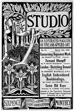
 Aubrey Beardsley, poster for The Studio
It's fun to see how dynamic black-and-white work can be. There's really quite a bit of text in this piece, and yet it all works, and it's beautiful and organic. Aubrey Beardsley is really a genius with black-and-white - check out some of his other work to see some great combinations of detailed texture and large fields of solid black/solid white.
Aubrey Beardsley, poster for The Studio
It's fun to see how dynamic black-and-white work can be. There's really quite a bit of text in this piece, and yet it all works, and it's beautiful and organic. Aubrey Beardsley is really a genius with black-and-white - check out some of his other work to see some great combinations of detailed texture and large fields of solid black/solid white.
 Théophile Steinlen, Chat Noir poster
There's so much to love in this ubiquitous poster. First of all, you just have to love the limited color palette. The red and black and yellow are so striking together. Second, the hand-drawn text! It's so beautiful and interesting. Third, I like the attitude on that cat - it's not cute, it's tough. I love the striking red block at the bottom of the piece, and the way the cat's tail curves over the text.
Théophile Steinlen, Chat Noir poster
There's so much to love in this ubiquitous poster. First of all, you just have to love the limited color palette. The red and black and yellow are so striking together. Second, the hand-drawn text! It's so beautiful and interesting. Third, I like the attitude on that cat - it's not cute, it's tough. I love the striking red block at the bottom of the piece, and the way the cat's tail curves over the text.
 Albert Angus Turbayne, poster for Macmillan’s illustrated Standard Novels
Again, the wonders worked with a limited color palette! This peacock is just plain cool - I love how the tail swoops around the text. It's a little busy, but overall it works. I think the bits of blue help anchor the complexity of the design. Check out the little scarab hiding in the top left corner.
Albert Angus Turbayne, poster for Macmillan’s illustrated Standard Novels
Again, the wonders worked with a limited color palette! This peacock is just plain cool - I love how the tail swoops around the text. It's a little busy, but overall it works. I think the bits of blue help anchor the complexity of the design. Check out the little scarab hiding in the top left corner.
 Fred Ramsdell, Crescent Cycles poster
Okay, I know - another red-haired bicycle poster. But this one's different, really - it's, um...not french?
This has great vintage poster elements. Say it with me: Limited Color Palette! I like the impact of the large fields of color - there's a simplicity to this piece, and it's so striking.
Why, you may ask, are there so many babes in these bicycle posters? It's because these self-powered vehicles offered women freedoms they may not have had before! Now you've learned something new for the day!
And now, a technical tip: if you're having trouble keeping your "float"ed images from floating next to each other, try putting them in divs with the style of "clear: both."
Fred Ramsdell, Crescent Cycles poster
Okay, I know - another red-haired bicycle poster. But this one's different, really - it's, um...not french?
This has great vintage poster elements. Say it with me: Limited Color Palette! I like the impact of the large fields of color - there's a simplicity to this piece, and it's so striking.
Why, you may ask, are there so many babes in these bicycle posters? It's because these self-powered vehicles offered women freedoms they may not have had before! Now you've learned something new for the day!
And now, a technical tip: if you're having trouble keeping your "float"ed images from floating next to each other, try putting them in divs with the style of "clear: both."
 Georges Massias, Gladiator Cycles poster
I absolutely love this Gladiator Cycles poster. It's pretty much designed for Kate: it's got stars, and long flowing hair, and surrealism. I also really like the contrasting colors - the intense orange of the woman's hair and skin, against the blue of the sky.
Georges Massias, Gladiator Cycles poster
I absolutely love this Gladiator Cycles poster. It's pretty much designed for Kate: it's got stars, and long flowing hair, and surrealism. I also really like the contrasting colors - the intense orange of the woman's hair and skin, against the blue of the sky.
 Aubrey Beardsley, poster for The Studio
It's fun to see how dynamic black-and-white work can be. There's really quite a bit of text in this piece, and yet it all works, and it's beautiful and organic. Aubrey Beardsley is really a genius with black-and-white - check out some of his other work to see some great combinations of detailed texture and large fields of solid black/solid white.
Aubrey Beardsley, poster for The Studio
It's fun to see how dynamic black-and-white work can be. There's really quite a bit of text in this piece, and yet it all works, and it's beautiful and organic. Aubrey Beardsley is really a genius with black-and-white - check out some of his other work to see some great combinations of detailed texture and large fields of solid black/solid white.
 Théophile Steinlen, Chat Noir poster
There's so much to love in this ubiquitous poster. First of all, you just have to love the limited color palette. The red and black and yellow are so striking together. Second, the hand-drawn text! It's so beautiful and interesting. Third, I like the attitude on that cat - it's not cute, it's tough. I love the striking red block at the bottom of the piece, and the way the cat's tail curves over the text.
Théophile Steinlen, Chat Noir poster
There's so much to love in this ubiquitous poster. First of all, you just have to love the limited color palette. The red and black and yellow are so striking together. Second, the hand-drawn text! It's so beautiful and interesting. Third, I like the attitude on that cat - it's not cute, it's tough. I love the striking red block at the bottom of the piece, and the way the cat's tail curves over the text.
 Albert Angus Turbayne, poster for Macmillan’s illustrated Standard Novels
Again, the wonders worked with a limited color palette! This peacock is just plain cool - I love how the tail swoops around the text. It's a little busy, but overall it works. I think the bits of blue help anchor the complexity of the design. Check out the little scarab hiding in the top left corner.
Albert Angus Turbayne, poster for Macmillan’s illustrated Standard Novels
Again, the wonders worked with a limited color palette! This peacock is just plain cool - I love how the tail swoops around the text. It's a little busy, but overall it works. I think the bits of blue help anchor the complexity of the design. Check out the little scarab hiding in the top left corner.
 Fred Ramsdell, Crescent Cycles poster
Okay, I know - another red-haired bicycle poster. But this one's different, really - it's, um...not french?
This has great vintage poster elements. Say it with me: Limited Color Palette! I like the impact of the large fields of color - there's a simplicity to this piece, and it's so striking.
Why, you may ask, are there so many babes in these bicycle posters? It's because these self-powered vehicles offered women freedoms they may not have had before! Now you've learned something new for the day!
Fred Ramsdell, Crescent Cycles poster
Okay, I know - another red-haired bicycle poster. But this one's different, really - it's, um...not french?
This has great vintage poster elements. Say it with me: Limited Color Palette! I like the impact of the large fields of color - there's a simplicity to this piece, and it's so striking.
Why, you may ask, are there so many babes in these bicycle posters? It's because these self-powered vehicles offered women freedoms they may not have had before! Now you've learned something new for the day!
Tuesday, January 24, 2012
I've discovered Xtranormal
Some discussions about social media got me all fired up for a friendlier, more approachable face to the library - a face that's not afraid to be FUNNY.
(This video is actually, in a way, published, so it's time to be proud of my library system!)
Subscribe to:
Posts (Atom)