...Emerald!
Pantone.com
This is a trend prediction for next year, not an analysis of last year. We'll see how it goes - I thought their prediction for 2012, a reddish-orange, fell flat, while the prediction for 2011, a bright pink, was spot-on.
I'm always happy when green is involved!

Showing posts with label color. Show all posts
Showing posts with label color. Show all posts
Friday, December 7, 2012

Sunday, February 5, 2012
Design Inspiration - Art Nouveau
I've got the fever. ART NOUVEAU FEVER.
While I enjoy the lamps and jewelry and some (though not all) of the architecture, what I'm really obsessed with is the graphic design. Posters, book covers, book illustrations - they're all fantastic. Here are some great ones, more or less randomly selected from, you know, stuff I found on the internet:
 Georges Massias, Gladiator Cycles poster
I absolutely love this Gladiator Cycles poster. It's pretty much designed for Kate: it's got stars, and long flowing hair, and surrealism. I also really like the contrasting colors - the intense orange of the woman's hair and skin, against the blue of the sky.
Georges Massias, Gladiator Cycles poster
I absolutely love this Gladiator Cycles poster. It's pretty much designed for Kate: it's got stars, and long flowing hair, and surrealism. I also really like the contrasting colors - the intense orange of the woman's hair and skin, against the blue of the sky.
 Aubrey Beardsley, poster for The Studio
It's fun to see how dynamic black-and-white work can be. There's really quite a bit of text in this piece, and yet it all works, and it's beautiful and organic. Aubrey Beardsley is really a genius with black-and-white - check out some of his other work to see some great combinations of detailed texture and large fields of solid black/solid white.
Aubrey Beardsley, poster for The Studio
It's fun to see how dynamic black-and-white work can be. There's really quite a bit of text in this piece, and yet it all works, and it's beautiful and organic. Aubrey Beardsley is really a genius with black-and-white - check out some of his other work to see some great combinations of detailed texture and large fields of solid black/solid white.
 Théophile Steinlen, Chat Noir poster
There's so much to love in this ubiquitous poster. First of all, you just have to love the limited color palette. The red and black and yellow are so striking together. Second, the hand-drawn text! It's so beautiful and interesting. Third, I like the attitude on that cat - it's not cute, it's tough. I love the striking red block at the bottom of the piece, and the way the cat's tail curves over the text.
Théophile Steinlen, Chat Noir poster
There's so much to love in this ubiquitous poster. First of all, you just have to love the limited color palette. The red and black and yellow are so striking together. Second, the hand-drawn text! It's so beautiful and interesting. Third, I like the attitude on that cat - it's not cute, it's tough. I love the striking red block at the bottom of the piece, and the way the cat's tail curves over the text.
 Albert Angus Turbayne, poster for Macmillan’s illustrated Standard Novels
Again, the wonders worked with a limited color palette! This peacock is just plain cool - I love how the tail swoops around the text. It's a little busy, but overall it works. I think the bits of blue help anchor the complexity of the design. Check out the little scarab hiding in the top left corner.
Albert Angus Turbayne, poster for Macmillan’s illustrated Standard Novels
Again, the wonders worked with a limited color palette! This peacock is just plain cool - I love how the tail swoops around the text. It's a little busy, but overall it works. I think the bits of blue help anchor the complexity of the design. Check out the little scarab hiding in the top left corner.
 Fred Ramsdell, Crescent Cycles poster
Okay, I know - another red-haired bicycle poster. But this one's different, really - it's, um...not french?
This has great vintage poster elements. Say it with me: Limited Color Palette! I like the impact of the large fields of color - there's a simplicity to this piece, and it's so striking.
Why, you may ask, are there so many babes in these bicycle posters? It's because these self-powered vehicles offered women freedoms they may not have had before! Now you've learned something new for the day!
And now, a technical tip: if you're having trouble keeping your "float"ed images from floating next to each other, try putting them in divs with the style of "clear: both."
Fred Ramsdell, Crescent Cycles poster
Okay, I know - another red-haired bicycle poster. But this one's different, really - it's, um...not french?
This has great vintage poster elements. Say it with me: Limited Color Palette! I like the impact of the large fields of color - there's a simplicity to this piece, and it's so striking.
Why, you may ask, are there so many babes in these bicycle posters? It's because these self-powered vehicles offered women freedoms they may not have had before! Now you've learned something new for the day!
And now, a technical tip: if you're having trouble keeping your "float"ed images from floating next to each other, try putting them in divs with the style of "clear: both."
 Georges Massias, Gladiator Cycles poster
I absolutely love this Gladiator Cycles poster. It's pretty much designed for Kate: it's got stars, and long flowing hair, and surrealism. I also really like the contrasting colors - the intense orange of the woman's hair and skin, against the blue of the sky.
Georges Massias, Gladiator Cycles poster
I absolutely love this Gladiator Cycles poster. It's pretty much designed for Kate: it's got stars, and long flowing hair, and surrealism. I also really like the contrasting colors - the intense orange of the woman's hair and skin, against the blue of the sky.
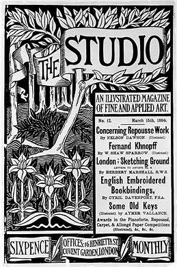 Aubrey Beardsley, poster for The Studio
It's fun to see how dynamic black-and-white work can be. There's really quite a bit of text in this piece, and yet it all works, and it's beautiful and organic. Aubrey Beardsley is really a genius with black-and-white - check out some of his other work to see some great combinations of detailed texture and large fields of solid black/solid white.
Aubrey Beardsley, poster for The Studio
It's fun to see how dynamic black-and-white work can be. There's really quite a bit of text in this piece, and yet it all works, and it's beautiful and organic. Aubrey Beardsley is really a genius with black-and-white - check out some of his other work to see some great combinations of detailed texture and large fields of solid black/solid white.
 Théophile Steinlen, Chat Noir poster
There's so much to love in this ubiquitous poster. First of all, you just have to love the limited color palette. The red and black and yellow are so striking together. Second, the hand-drawn text! It's so beautiful and interesting. Third, I like the attitude on that cat - it's not cute, it's tough. I love the striking red block at the bottom of the piece, and the way the cat's tail curves over the text.
Théophile Steinlen, Chat Noir poster
There's so much to love in this ubiquitous poster. First of all, you just have to love the limited color palette. The red and black and yellow are so striking together. Second, the hand-drawn text! It's so beautiful and interesting. Third, I like the attitude on that cat - it's not cute, it's tough. I love the striking red block at the bottom of the piece, and the way the cat's tail curves over the text.
 Albert Angus Turbayne, poster for Macmillan’s illustrated Standard Novels
Again, the wonders worked with a limited color palette! This peacock is just plain cool - I love how the tail swoops around the text. It's a little busy, but overall it works. I think the bits of blue help anchor the complexity of the design. Check out the little scarab hiding in the top left corner.
Albert Angus Turbayne, poster for Macmillan’s illustrated Standard Novels
Again, the wonders worked with a limited color palette! This peacock is just plain cool - I love how the tail swoops around the text. It's a little busy, but overall it works. I think the bits of blue help anchor the complexity of the design. Check out the little scarab hiding in the top left corner.
 Fred Ramsdell, Crescent Cycles poster
Okay, I know - another red-haired bicycle poster. But this one's different, really - it's, um...not french?
This has great vintage poster elements. Say it with me: Limited Color Palette! I like the impact of the large fields of color - there's a simplicity to this piece, and it's so striking.
Why, you may ask, are there so many babes in these bicycle posters? It's because these self-powered vehicles offered women freedoms they may not have had before! Now you've learned something new for the day!
Fred Ramsdell, Crescent Cycles poster
Okay, I know - another red-haired bicycle poster. But this one's different, really - it's, um...not french?
This has great vintage poster elements. Say it with me: Limited Color Palette! I like the impact of the large fields of color - there's a simplicity to this piece, and it's so striking.
Why, you may ask, are there so many babes in these bicycle posters? It's because these self-powered vehicles offered women freedoms they may not have had before! Now you've learned something new for the day!
Friday, December 9, 2011
Pantone's Color of the Year for 2012
It's that time again - time for something that I still can't believe is a big deal - Pantone has declared the Color of the Year to be "Tangerine Tango,"
Read all about it:
http://www.pantone.com/pages/pantone/category.aspx?ca=88
The official color is a super-saturated red-orange. I have to say, I haven't particularly noticed the trend. Last year, the bright pink that they called "Honeysuckle" (which I will forever call "carnation pink" thanks to the Crayola boxes of my childhood) was EVERYWHERE. You could look through the junk mail, and half of it was pink! I thought to myself, "Wow, maybe Pantone is really trend-connected." Now I'm not so sure - I guess I'll wait to see if my junk mail will start to be orange.
Read all about it:
http://www.pantone.com/pages/pantone/category.aspx?ca=88
The official color is a super-saturated red-orange. I have to say, I haven't particularly noticed the trend. Last year, the bright pink that they called "Honeysuckle" (which I will forever call "carnation pink" thanks to the Crayola boxes of my childhood) was EVERYWHERE. You could look through the junk mail, and half of it was pink! I thought to myself, "Wow, maybe Pantone is really trend-connected." Now I'm not so sure - I guess I'll wait to see if my junk mail will start to be orange.
Saturday, December 11, 2010
Apparently this is a big deal?
So if you're seeing pink everywhere, this might be why.
http://www.pantone.com/pages/pantone/Pantone.aspx?ca=4&pg=20821
http://www.pantone.com/pages/pantone/Pantone.aspx?ca=4&pg=20821
Subscribe to:
Posts (Atom)