You know how some books that seem like niche books end up having a broader relevance? People say "Even if you don't care about molecular biology, you'll love this book!" Well, this is not one of those.
I just finished reading "Just My Type: a Book About Fonts" by Simon Garfield. I definitely enjoyed it, but it was a very geeky type of enjoyment - and even for geeks, the book has some flaws.
If you don't care at all about fonts, I doubt you'll much care to hear the author wax poetical about the tail of a Q or the design of the ampersand. There are some interesting stories in there - I think? Or will regular people, who aren't crazy about fonts, be completely unfazed by the story of a printer who tossed an ENTIRE FONT into the River Thames, bit by bit, over the course of years?
From the geeky perspective, my main problem was that there weren't enough examples! If you're going to rave about the height of a T or the shape of an E, it would really help to SHOW THE FONT.
Still, it's good nerdy fun! I had to admit to one of my coworkers that I was laughing out loud at a chapter about the World's Worst Fonts. (He thought the worst was the font for London's 2012 Olympics. I, however, think that Brushscript is really the worst. Seriously, it's SO BAD.)

Showing posts with label typography. Show all posts
Showing posts with label typography. Show all posts
Friday, May 4, 2012

Monday, April 30, 2012
Font Licensing; or, Why I am Awake in the Middle of the Night
So I've been reading a book about fonts (which will probably be reviewed in my next post), and it keeps mentioning a license for using a font. This got me worried about the fact that I don't really know the rules about when and how you can and can't use a font. Here's my favorite summary so far:
http://www.jiscdigitalmedia.ac.uk/crossmedia/advice/fonts-basic-guide-to-font-licensing
(with the extra bonus of a fun graphic look)
In general, you can use the fonts that came on your computer without worrying about it - same goes for the fonts that come with Microsoft Office and with Adobe Creative Suite. The main things you should NOT do:
1. Download a font without reading the agreement. You don't want to use a font in a major campaign (or even a minor one) without knowing what the permissions are.
2. Swap fonts with other designers (even inside your office.) If I have a font installed on my computer, and my coworker doesn't have it, then they probably don't have a license to use it.
Respect the designer, respect the font!
http://www.jiscdigitalmedia.ac.uk/crossmedia/advice/fonts-basic-guide-to-font-licensing
(with the extra bonus of a fun graphic look)
In general, you can use the fonts that came on your computer without worrying about it - same goes for the fonts that come with Microsoft Office and with Adobe Creative Suite. The main things you should NOT do:
1. Download a font without reading the agreement. You don't want to use a font in a major campaign (or even a minor one) without knowing what the permissions are.
2. Swap fonts with other designers (even inside your office.) If I have a font installed on my computer, and my coworker doesn't have it, then they probably don't have a license to use it.
Respect the designer, respect the font!
Sunday, February 5, 2012
Design Inspiration - Art Nouveau
I've got the fever. ART NOUVEAU FEVER.
While I enjoy the lamps and jewelry and some (though not all) of the architecture, what I'm really obsessed with is the graphic design. Posters, book covers, book illustrations - they're all fantastic. Here are some great ones, more or less randomly selected from, you know, stuff I found on the internet:
 Georges Massias, Gladiator Cycles poster
I absolutely love this Gladiator Cycles poster. It's pretty much designed for Kate: it's got stars, and long flowing hair, and surrealism. I also really like the contrasting colors - the intense orange of the woman's hair and skin, against the blue of the sky.
Georges Massias, Gladiator Cycles poster
I absolutely love this Gladiator Cycles poster. It's pretty much designed for Kate: it's got stars, and long flowing hair, and surrealism. I also really like the contrasting colors - the intense orange of the woman's hair and skin, against the blue of the sky.
 Aubrey Beardsley, poster for The Studio
It's fun to see how dynamic black-and-white work can be. There's really quite a bit of text in this piece, and yet it all works, and it's beautiful and organic. Aubrey Beardsley is really a genius with black-and-white - check out some of his other work to see some great combinations of detailed texture and large fields of solid black/solid white.
Aubrey Beardsley, poster for The Studio
It's fun to see how dynamic black-and-white work can be. There's really quite a bit of text in this piece, and yet it all works, and it's beautiful and organic. Aubrey Beardsley is really a genius with black-and-white - check out some of his other work to see some great combinations of detailed texture and large fields of solid black/solid white.
 Théophile Steinlen, Chat Noir poster
There's so much to love in this ubiquitous poster. First of all, you just have to love the limited color palette. The red and black and yellow are so striking together. Second, the hand-drawn text! It's so beautiful and interesting. Third, I like the attitude on that cat - it's not cute, it's tough. I love the striking red block at the bottom of the piece, and the way the cat's tail curves over the text.
Théophile Steinlen, Chat Noir poster
There's so much to love in this ubiquitous poster. First of all, you just have to love the limited color palette. The red and black and yellow are so striking together. Second, the hand-drawn text! It's so beautiful and interesting. Third, I like the attitude on that cat - it's not cute, it's tough. I love the striking red block at the bottom of the piece, and the way the cat's tail curves over the text.
 Albert Angus Turbayne, poster for Macmillan’s illustrated Standard Novels
Again, the wonders worked with a limited color palette! This peacock is just plain cool - I love how the tail swoops around the text. It's a little busy, but overall it works. I think the bits of blue help anchor the complexity of the design. Check out the little scarab hiding in the top left corner.
Albert Angus Turbayne, poster for Macmillan’s illustrated Standard Novels
Again, the wonders worked with a limited color palette! This peacock is just plain cool - I love how the tail swoops around the text. It's a little busy, but overall it works. I think the bits of blue help anchor the complexity of the design. Check out the little scarab hiding in the top left corner.
 Fred Ramsdell, Crescent Cycles poster
Okay, I know - another red-haired bicycle poster. But this one's different, really - it's, um...not french?
This has great vintage poster elements. Say it with me: Limited Color Palette! I like the impact of the large fields of color - there's a simplicity to this piece, and it's so striking.
Why, you may ask, are there so many babes in these bicycle posters? It's because these self-powered vehicles offered women freedoms they may not have had before! Now you've learned something new for the day!
And now, a technical tip: if you're having trouble keeping your "float"ed images from floating next to each other, try putting them in divs with the style of "clear: both."
Fred Ramsdell, Crescent Cycles poster
Okay, I know - another red-haired bicycle poster. But this one's different, really - it's, um...not french?
This has great vintage poster elements. Say it with me: Limited Color Palette! I like the impact of the large fields of color - there's a simplicity to this piece, and it's so striking.
Why, you may ask, are there so many babes in these bicycle posters? It's because these self-powered vehicles offered women freedoms they may not have had before! Now you've learned something new for the day!
And now, a technical tip: if you're having trouble keeping your "float"ed images from floating next to each other, try putting them in divs with the style of "clear: both."
 Georges Massias, Gladiator Cycles poster
I absolutely love this Gladiator Cycles poster. It's pretty much designed for Kate: it's got stars, and long flowing hair, and surrealism. I also really like the contrasting colors - the intense orange of the woman's hair and skin, against the blue of the sky.
Georges Massias, Gladiator Cycles poster
I absolutely love this Gladiator Cycles poster. It's pretty much designed for Kate: it's got stars, and long flowing hair, and surrealism. I also really like the contrasting colors - the intense orange of the woman's hair and skin, against the blue of the sky.
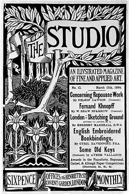 Aubrey Beardsley, poster for The Studio
It's fun to see how dynamic black-and-white work can be. There's really quite a bit of text in this piece, and yet it all works, and it's beautiful and organic. Aubrey Beardsley is really a genius with black-and-white - check out some of his other work to see some great combinations of detailed texture and large fields of solid black/solid white.
Aubrey Beardsley, poster for The Studio
It's fun to see how dynamic black-and-white work can be. There's really quite a bit of text in this piece, and yet it all works, and it's beautiful and organic. Aubrey Beardsley is really a genius with black-and-white - check out some of his other work to see some great combinations of detailed texture and large fields of solid black/solid white.
 Théophile Steinlen, Chat Noir poster
There's so much to love in this ubiquitous poster. First of all, you just have to love the limited color palette. The red and black and yellow are so striking together. Second, the hand-drawn text! It's so beautiful and interesting. Third, I like the attitude on that cat - it's not cute, it's tough. I love the striking red block at the bottom of the piece, and the way the cat's tail curves over the text.
Théophile Steinlen, Chat Noir poster
There's so much to love in this ubiquitous poster. First of all, you just have to love the limited color palette. The red and black and yellow are so striking together. Second, the hand-drawn text! It's so beautiful and interesting. Third, I like the attitude on that cat - it's not cute, it's tough. I love the striking red block at the bottom of the piece, and the way the cat's tail curves over the text.
 Albert Angus Turbayne, poster for Macmillan’s illustrated Standard Novels
Again, the wonders worked with a limited color palette! This peacock is just plain cool - I love how the tail swoops around the text. It's a little busy, but overall it works. I think the bits of blue help anchor the complexity of the design. Check out the little scarab hiding in the top left corner.
Albert Angus Turbayne, poster for Macmillan’s illustrated Standard Novels
Again, the wonders worked with a limited color palette! This peacock is just plain cool - I love how the tail swoops around the text. It's a little busy, but overall it works. I think the bits of blue help anchor the complexity of the design. Check out the little scarab hiding in the top left corner.
 Fred Ramsdell, Crescent Cycles poster
Okay, I know - another red-haired bicycle poster. But this one's different, really - it's, um...not french?
This has great vintage poster elements. Say it with me: Limited Color Palette! I like the impact of the large fields of color - there's a simplicity to this piece, and it's so striking.
Why, you may ask, are there so many babes in these bicycle posters? It's because these self-powered vehicles offered women freedoms they may not have had before! Now you've learned something new for the day!
Fred Ramsdell, Crescent Cycles poster
Okay, I know - another red-haired bicycle poster. But this one's different, really - it's, um...not french?
This has great vintage poster elements. Say it with me: Limited Color Palette! I like the impact of the large fields of color - there's a simplicity to this piece, and it's so striking.
Why, you may ask, are there so many babes in these bicycle posters? It's because these self-powered vehicles offered women freedoms they may not have had before! Now you've learned something new for the day!
Monday, January 3, 2011
Jonathan Strange & Mr. Norrell: a Love Letter
 Don't worry, I'm not going to use the direct address. No odes here. But I am going to use this opportunity to talk about some of the many things I love about this book.
 Why I love the cover:
I like the striking black and cream, and the simplicity of the design.
I especially like the starkness of the raven.
I love the font. I love the unevenness of it. I love the sharp point on the second stem of the N. I love the sweeping tail of the R. I love the asymmetrical slants on the beaks of the T. (Sorry if the terminology is confusing. Just look at the T and how it is asymmetrical, you'll see what I mean.)
And I love how well the odd, antiquated feel of the cover goes with the content.
Which brings us to...
Why I love the novel:
Pacing. This book doesn't rush; it takes its time revealing character, setting, system of magic, and story. There are footnotes. But by the end, I was utterly gripped. I stayed up until 4 in the morning to finish this book.
True unpredictability. I really enjoy not knowing what will happen, and the events of this book are truly original.
Love of books. It's a pervasive theme throughout the novel, and (of course) it rings deeply true for me.
Atmosphere. Victorian, gloomy, and mystical. Reminds me of the art of Arthur Rackham - check out this site and particularly, this image.
"Getting the magic right." When I read a fantasy book, one of my criteria for rating the book is the system of magic: is it well-conceived? Is it consistent? Essentially, is it believable?
Well, the system of magic in this book is well-conceived and believable, but for me it goes one step beyond that. When I read this book, there's a part of my brain that goes "Yeah! That's how real magic is!" It's much like I feel when I read a book with a child character, and the child character actually behaves like a child. I think "Hey, they got it right! That's what a kid would really do." Well...apparently I believe in magic, and apparently I believe that real magic is structured the way it's structured in Jonathan Strange.
Which is funny, because if you were to ask me, "Hey, Kate, if magic is real, what's it like?" I would describe something completely different. I would maybe have cited "Poison Study" or "The Name of the Wind." But neither of those books rings true for me the way Jonathan Strange does.
I like the striking black and cream, and the simplicity of the design.
I especially like the starkness of the raven.
I love the font. I love the unevenness of it. I love the sharp point on the second stem of the N. I love the sweeping tail of the R. I love the asymmetrical slants on the beaks of the T. (Sorry if the terminology is confusing. Just look at the T and how it is asymmetrical, you'll see what I mean.)
And I love how well the odd, antiquated feel of the cover goes with the content.
Which brings us to...
Why I love the novel:
Pacing. This book doesn't rush; it takes its time revealing character, setting, system of magic, and story. There are footnotes. But by the end, I was utterly gripped. I stayed up until 4 in the morning to finish this book.
True unpredictability. I really enjoy not knowing what will happen, and the events of this book are truly original.
Love of books. It's a pervasive theme throughout the novel, and (of course) it rings deeply true for me.
Atmosphere. Victorian, gloomy, and mystical. Reminds me of the art of Arthur Rackham - check out this site and particularly, this image.

"Getting the magic right." When I read a fantasy book, one of my criteria for rating the book is the system of magic: is it well-conceived? Is it consistent? Essentially, is it believable?
Well, the system of magic in this book is well-conceived and believable, but for me it goes one step beyond that. When I read this book, there's a part of my brain that goes "Yeah! That's how real magic is!" It's much like I feel when I read a book with a child character, and the child character actually behaves like a child. I think "Hey, they got it right! That's what a kid would really do." Well...apparently I believe in magic, and apparently I believe that real magic is structured the way it's structured in Jonathan Strange.
Which is funny, because if you were to ask me, "Hey, Kate, if magic is real, what's it like?" I would describe something completely different. I would maybe have cited "Poison Study" or "The Name of the Wind." But neither of those books rings true for me the way Jonathan Strange does.
Thursday, December 16, 2010
Font Hatred
My boss recently sent me a link to this article:
http://greatergreaterwashington.org/post/8451/sign-font-will-affect-perception-of-silver-spring-library/
The shocking conclusion? Font matters! (Gee, do you think?)
But what actually struck me was this quote:
"Please, for the love of Gutenberg, do not despoil the facade of this wonderful new building by setting the 40-foot "Silver Spring Library" sign in Arial," pleaded Brad.
Goodness, what a reaction! But this isn't at all unusual - people who care about fonts tend to care A LOT. Case in point: the unbridled hatred of Comic Sans: http://bancomicsans.com/
Personally, I find this hilarious. I mean, Comic Sans is a goofy font, but I think it's goofy on purpose, so what's wrong with that? Of course, like any type of humor, it's appropriate in some situations and not in others.
Here's an article about why designers hate the font:
http://www.thedesigncubicle.com/2008/12/why-exactly-designers-hate-comic-sans/
And a humorous rebuttal: http://trueslant.com/lewisgrossberger/2010/07/09/you-hate-comic-sans-well-i-hate-you-so-there/
I rarely see a good objection to Comic Sans itself, just objections to its ubiquity and comments about situation-appropriateness.
Which brings me back to Arial. I was surprised to find that while Arial does not have a web page devoted to its destruction, it seems to be just as widely despised.
In fact, I found the objections to Arial much more coherent:
http://martigold.com/designblog/?p=18
My first thought in response to all these objections was "Ridiculous! I don't hate Arial!" But actually, I AM kindof sick of it. I like sans serif fonts for many library applications, but I always find myself looking for another font before I'll go with Arial, especially when it comes to large lettering.
I don't know if we'll ever be able to get away from Arial overuse. It's easy to read and widely available. Also, some of our publications were born using Arial Narrow, and it's been extremely difficult to convince my coworkers to consider changing the font. Sigh.
I'll leave you with this brief article about fonts not to use: http://modernl.com/article/5-terrible-fonts-that-you-should-not-use-in-print-design
Now, I think "never" is too strong a word - I use these fonts sometimes - but I still think it's worth reading the article, being aware of the opinions, and starting to think about your font choices.
http://greatergreaterwashington.org/post/8451/sign-font-will-affect-perception-of-silver-spring-library/
The shocking conclusion? Font matters! (Gee, do you think?)
But what actually struck me was this quote:
"Please, for the love of Gutenberg, do not despoil the facade of this wonderful new building by setting the 40-foot "Silver Spring Library" sign in Arial," pleaded Brad.
Goodness, what a reaction! But this isn't at all unusual - people who care about fonts tend to care A LOT. Case in point: the unbridled hatred of Comic Sans: http://bancomicsans.com/
Personally, I find this hilarious. I mean, Comic Sans is a goofy font, but I think it's goofy on purpose, so what's wrong with that? Of course, like any type of humor, it's appropriate in some situations and not in others.
Here's an article about why designers hate the font:
http://www.thedesigncubicle.com/2008/12/why-exactly-designers-hate-comic-sans/
And a humorous rebuttal: http://trueslant.com/lewisgrossberger/2010/07/09/you-hate-comic-sans-well-i-hate-you-so-there/
I rarely see a good objection to Comic Sans itself, just objections to its ubiquity and comments about situation-appropriateness.
Which brings me back to Arial. I was surprised to find that while Arial does not have a web page devoted to its destruction, it seems to be just as widely despised.
In fact, I found the objections to Arial much more coherent:
http://martigold.com/designblog/?p=18
My first thought in response to all these objections was "Ridiculous! I don't hate Arial!" But actually, I AM kindof sick of it. I like sans serif fonts for many library applications, but I always find myself looking for another font before I'll go with Arial, especially when it comes to large lettering.
I don't know if we'll ever be able to get away from Arial overuse. It's easy to read and widely available. Also, some of our publications were born using Arial Narrow, and it's been extremely difficult to convince my coworkers to consider changing the font. Sigh.
I'll leave you with this brief article about fonts not to use: http://modernl.com/article/5-terrible-fonts-that-you-should-not-use-in-print-design
Now, I think "never" is too strong a word - I use these fonts sometimes - but I still think it's worth reading the article, being aware of the opinions, and starting to think about your font choices.
Subscribe to:
Posts (Atom)